By Khalid Khattak
Welcome to our new series “DataViz Decode”, where we break down compelling charts and graphics to uncover the design choices, data insights, and storytelling techniques that make them work.
Data visualization isn’t just about making charts look good. It’s about making complex ideas easy to understand. Today’s featured graphic, which explains how earthquakes are measured, is a great example of clear and smart design. Let’s take a closer look at what makes it so effective.
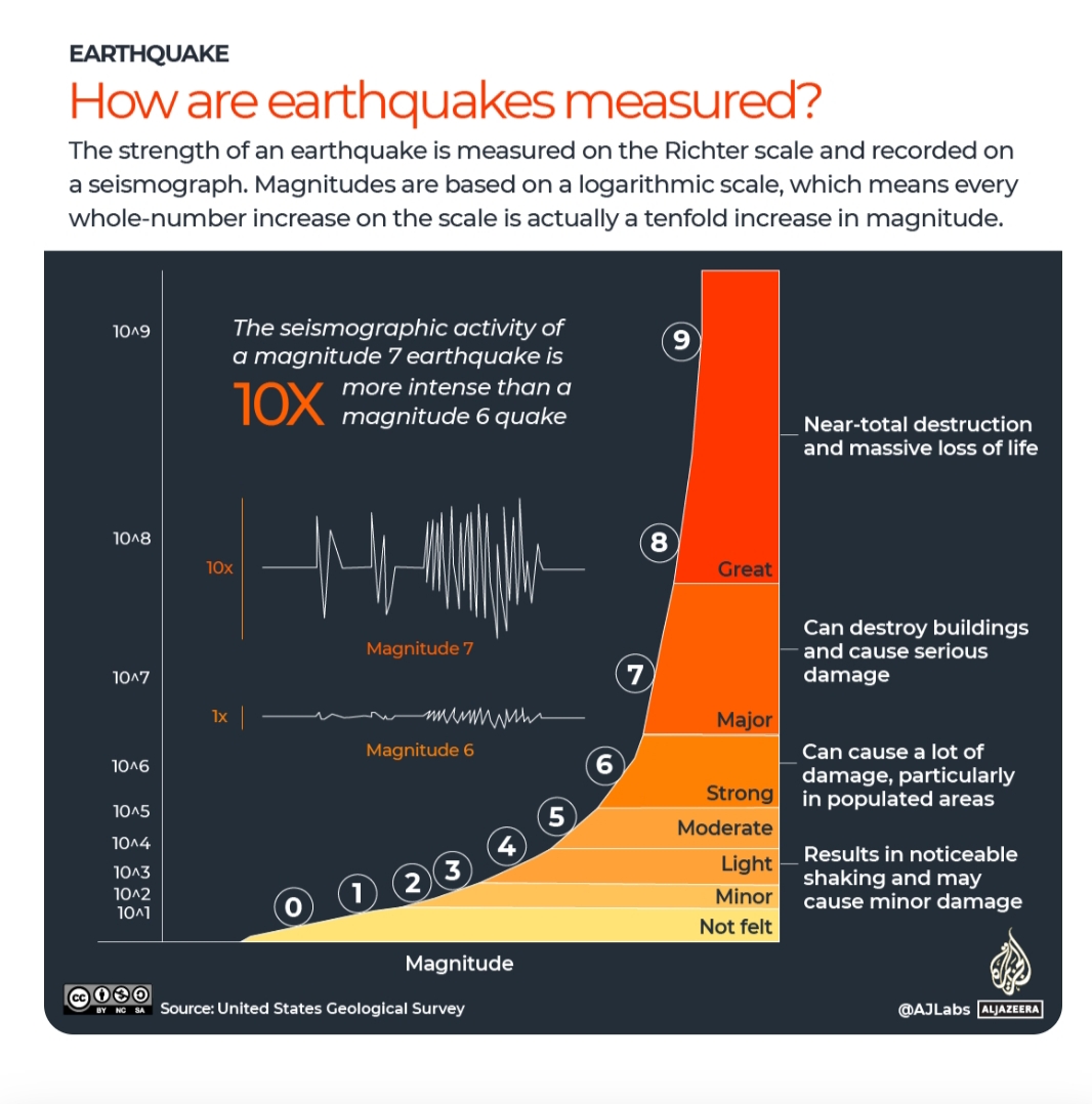
The chart above was originally created by AJLabs to explain how earthquakes are measured. This chart doesn’t rely on just one visual element to tell its story. Instead, it uses several complementary approaches.
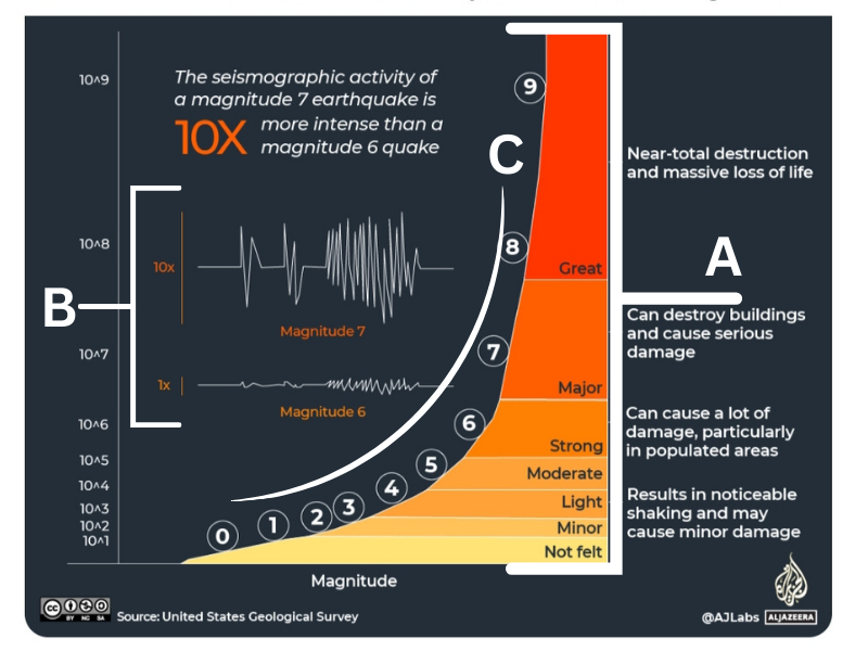
Note: The section A, B and C aren’t part of the original visualization as shown below. We have added them to help guide our breakdown and make the design easier to follow.
The power of multiple visual cues
Color as intensity (A):The background shifts from cool yellow (minor earthquakes) to intense red (catastrophic ones). This color progression mirrors our intuitive understanding, yellow suggests caution, red screams danger.
Size shows scale (B): As earthquake magnitude increases, seismograph readings grow bigger and more chaotic. A magnitude 6 quake shows moderate, rolling motion, while magnitude 7 creates violent spikes that fill the entire frame.
Position reinforces hierarchy (C): The logarithmic curve naturally draws your eye upward, emphasizing how dramatically earthquake intensity increases with each number.
Context makes data meaningful
Numbers alone don’t tell the whole story. A “magnitude 7” earthquake means nothing to most people until you add context. This visualization excels by pairing each magnitude level with real-world consequences:
– “Not felt” (magnitude 0-2)
– “Can cause a lot of damage, particularly in populated areas” (magnitude 6)
– “Near-total destruction and massive loss of life” (magnitude 9)
These descriptions transform abstract numbers into visceral understanding.
When numbers become human stories
The importance of understanding these scales becomes tragically clear when we look at recent events. Just yesterday, on August 31, a magnitude 6.0 earthquake struck eastern Afghanistan, killing at least 800 people and injuring over 2,500 others.
These devastating events remind us that data visualization isn’t just an academic exercise. When we help people understand the true scale of earthquake intensity, we’re potentially helping them make better decisions about building codes, emergency preparedness, and risk assessment.
What we can learn
Effective data visualization follows several principles demonstrated here:
- Layer your story: Use color, size, position, and text together
- Provide context: Raw numbers need real-world meaning
- Challenge misconceptions: If your audience likely misunderstands something, address it directly
- Guide the eye: Use visual hierarchy to emphasize your main point
- Keep it clean: Despite multiple elements, the chart never feels cluttered
What visualization would you like us to analyze next? Share your suggestions in the comments below.


")


